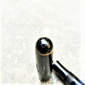
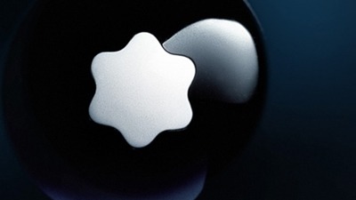
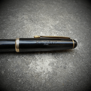
Montblanc 342 G with Black Star.
Happiness, many lovers of fountain pens will agree, is a six-sided white star – the Montblanc logo, especially on the crest of a resin cap. It was way back in 1913 that the Montblanc star emblem became the brand logo and trademark. All writing instruments produced by the Simplo Filler Pen Co (yes, the company was to be christened Montblanc much later) ever since would include the unmistakable rounded star. The shape represents the snow-covered peak of the Mont Blanc – the highest European mountain, symbolising the brand’s commitment to the highest quality and finest European craftsmanship. But all that, I guess, is common knowledge.
For, what I am going to talk about now, is not that common – a Montblanc fountain pen, with the logo in black!
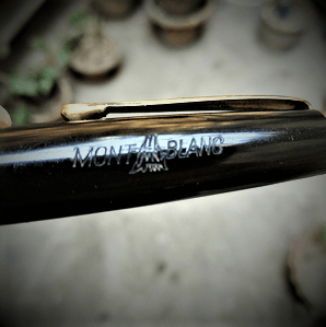
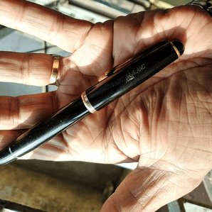
Yes, I am talking about the 342 G. It is a simple black pen, a piston filler with a fairly conservative design – one that is a tad smaller in size and is literally a lightweight when compared to its siblings in my collection. Such unstated is the design that the only high point in the pen seems to be the blue ink window which was de rigueur those days and the only hint of accoutrements is a gold-plated trim, not to mention the clip of the same material. Needless to say, the German obsession with engineering perfection is writ large on the pen, which also features the name Montblanc stylised with the peak incorporated in the lettering, hot-stamped on the acrylic cap.
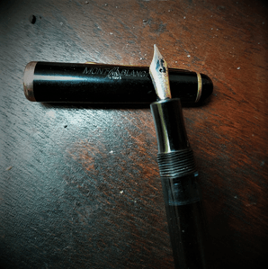
The nib too, is bared of all embellishments, pared literally down to the basic information – Montblanc 14C 585. The piston knob informs the seeker that the pen is a 342 G.
The pen sports a KF (Kugel Fine) nib that is flex and was meant to write at different angles and it does. Mind you it is not a full flex, but “merely” an ordinary everyday flex, that gives your writing just the depth that is needed to make it stand apart, as opposed to the exaggerated flourish sought by the calligraphers. As a matter of fact, I do not have enough mastery over the language to explain the sheer joy it is to write with the pen. It is something akin to the first time when the eyes lock and the butterflies start fluttering in the heart, love at first scribble. The ink flows like Mother Nature’s milk of kindness and the pen glides, reminding one of the majestic eagle spreading its wings as it soars. The simple, awe inspiring ink capacity of the pen (more so considering its relatively small size) is another reason that justifies the comparison with the eagle – like all Montblancs, this too, rightfully deserves a place at the very top of the food chain.
Considering the fact that these pens were last made in 1960’s (first production was post 1948), they are vintage –though they are widely considered as extremely rare collectables and as near antique class as one can get to. The black outline of the Montblanc star on the cap, instead of the usual white snow-capped peak makes the pen rarer, as apparently, it was only in the early models that this outline was featured. Going by this,the pen should be early 1950’s. Later models (which were made of resin as opposed to the acrylic of the earlier batches) were also made with available steel nibs (one apparently even had a glass one) and came with a choice of body and ink window colours, though the black with the blue ink window and the gold nib naturally remains the most sought after.
After the World War II, Montblanc’s production restarted in 1948, which though marked the decommissioning of pre-war models, retained the three-digit numbering system, where the first digit denoted the quality (or price range), the second the filling / loading system and the third the nib size (or even the size of the pen relative to the nib). Naturally, the top end models meant for export – the 14X and the 24X were accorded first-priority and it was only in 1951 that the more economical segment of the market was addressed with the introduction of the 342 and the 344.
The “342G” would thus denote one that is in the economical range, with a piston filler and a small sized nib. The suffix G indicated a “Goldfeder” – that the pen was originally equipped with a 14C gold nib. The number of bands around the cap too was indicative.

This pen was certainly not Montblanc’s top gun in its time, yet, it remains, after decades of dedicated service, a main battle tank ready to roll though the enemy lines. If that is not enough to make any lover of writing instruments jump on to his / her feet and salute it with all the reverence it commands, what will?
PS. The Mont Rosa followed this winner. To read about it, click here.
The 34x pens are wonderful indeed. Even though they are “third-line” pens, their quality and durability are top-notch, making them very desirable to collectors.
I always enjoy reading your posts.
just curious, but how much would such a pen cost in the market today? what would be a realistic, fair price if one wanted to buy one?
Love to see such pens. Mont Blanc is a household name among pen enthusiasts. Good to collect them