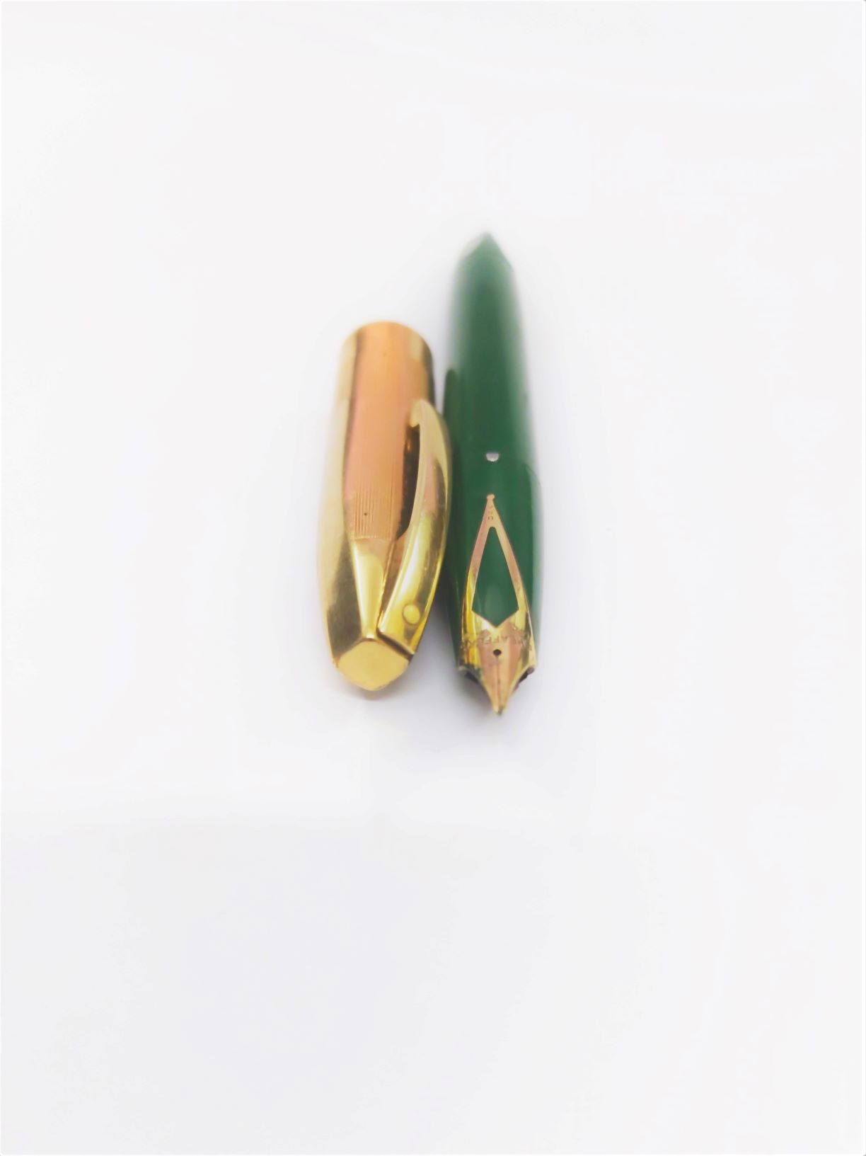
PFM – are you “Man” enough for it?
The year was 1959. The years leading to it had seen a move by most US fountain pen manufacturers towards the slender, longish pens like what were popularly referred to as the TM or the Thin Model Pens. Sheaffer was battling it out in the marketplace with Parker’s streamlined 51 with its Snorkel – which arguably featured the most complex filling system in the history of fountain pens. Thus, the “Pen For Men” (PFM) launched to attract the eyeballs for the gifting season was unique in many ways: it had to be.
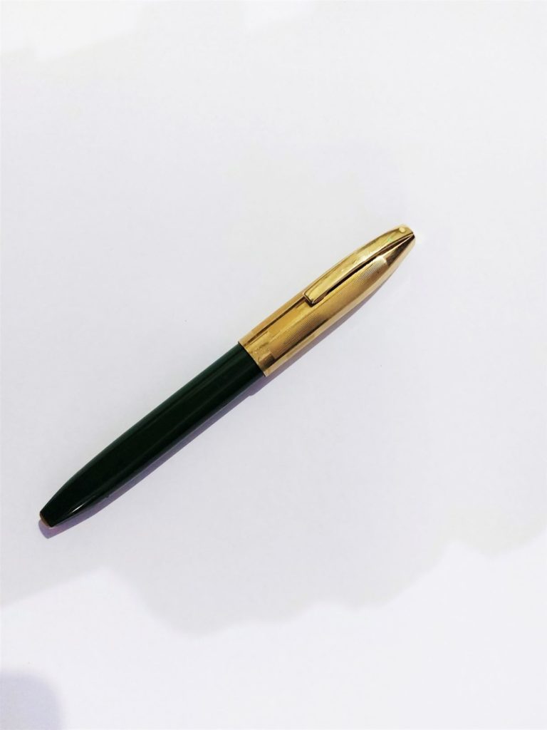
For one, PFM featured a distinctive move away from the design norms of the day – with its retro, larger and fatter look. As a matter of fact, the PFM was Sheaffer’s largest Snorkel model! It did take a lot of management chutzpah to go zig when the market was going zag and one can only imagine the sleepless nights that must have accompanied the launch. Mind you, the decision must have been momentous, for it was a high-stake stand-off with the Parker 51 and Sheaffer, which had seen its fifty millionth pen roll out of its assembly line in 1951, could ill afford to err.
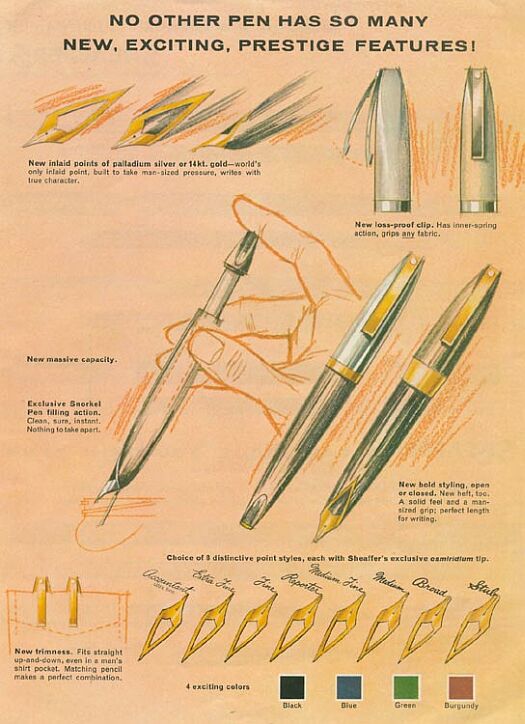
The PFM also featured, for the first time, an inlaid nib moulded directly into the gripping section of the pen. It was nothing like what the world had seen before, and was justifiably touted as a key feature of the pen. From the standard open or hooded nibs that were in vogue, the inlaid nib was a huge departure and like the white dot, continues to be a Sheaffer hallmark, a bold and distinct attention grabber.
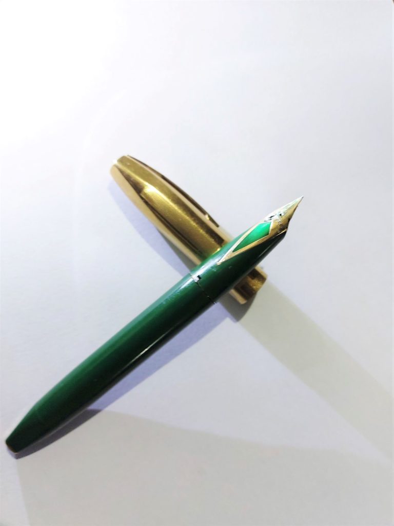
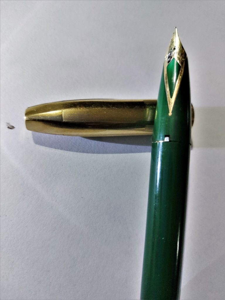
The PFM is also hailed for small details, some evolutionary, some out and out and out revolutionary for the day. The spring clip, which was introduced by Sheaffers a decade back in the early 1940’s was made bigger and features a squared-off design which accords the PFM a better grip in the shirt pocket. The Snorkel lineage notwithstanding, it also has a much bigger bladder which naturally makes room for way more ink carrying capacity. The three-peg friction fit mechanism incorporated in the cap with a ridge created inside the cap to allow it to snap on, was another bold departure from the tradition of having screw in caps. Little wonder the Sheaffer advertisements that introduced the ballistic missile claimed that “no other pen has so many new, exciting, prestige features”!
The pen came in five models differentiated by the cap and trim colours, of which, the model featured in this story is the PFM V with its trademark Gold plated cap and plastic barrel, gold filled clip and plunger cap end plate, and 14kt gold nib. The PFM Autograph – a variation of the PFM III with a 14 K gold cap band was also introduced to cater to a niche in the market that preferred engraved customisations.
In its time however, the pen was not such a huge success as its features could rightfully demand and the line was discontinued in 1968. However, they continue to remain highly collectable and are often considered to be at par with the Parker Duofold Mandarin in terms of their ability to enrich collections. When they were introduced, the PFM pens were priced from US $ 10 for the PFM I to US $ 25 for the PFM V which is roughly equivalent to US $ 100 to US $ 225 now, though in terms of the actual moolah dished out by collectors who mostly seek out the PFM Autograph and the PFM V (Green, Grey and Blue in terms of desirability) often paired with the matching pencils is mostly way above such figures.
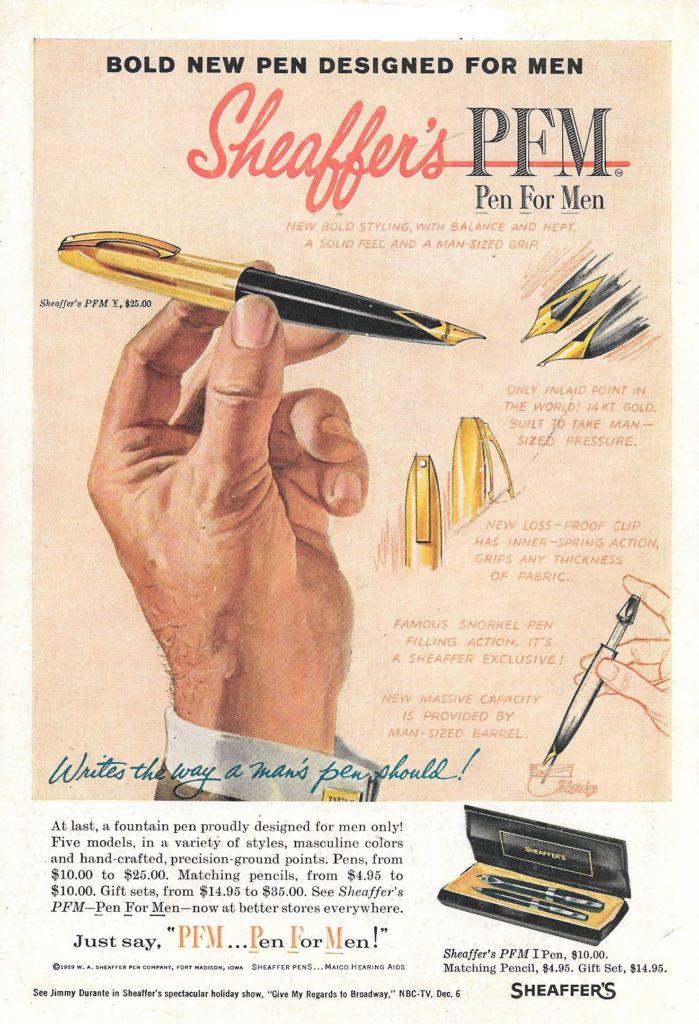
“Just say PFM – Pen For Men”, the advertisements had urged and contrary to what the nay-sayers would want us to believe, it wasn’t “sexist” then, as we know the term now. To put the advertisements in the right perspective, 1959 was also the year that a Swiss referendum denied women the right to vote and the body copy in the PFM communications that emphasised the “man-sized grip”, “man-sized pressure” or “man-sized barrel” were not really out of place in the then social order. Unfortunate, perhaps, but true. That perhaps also explains why all the allegations that the PFM copy was a tongue-in-cheek effort to peddle phallic symbolism sounds a bit farfetched – yes, me feels, even that “new massive capacity is provided by man-sized barrel” is taking things a bit too far, after all, the Marlboro Man was conceived only in 1954. Besides, no one really complains about the so-called “lady” lines, do they? Then why single out the PFM?
The PFM that I have featured in this story, is almost a decade elder to me and continues to be a long and trusted friend. I love the way it looks and am absolutely gaga about the way it writes. Does anything else really matter?
For a more on the Snorkel: https://www.inkedhappiness.com/sheaffers-snorkel-the-worlds-most-complicated-filling-system-ever/

Classic!
I have many beloved fountain pens, but the Aurora 88 (both vintage and modern) and Sheaffer’s PFM (the V and IV) are my two absolute favorite pens of all time. The 88 and the PFM are the two pens that, to me, come closest to absolute perfection. I love them to death!